- Design
- Layout
- Content
- Colors
- Pictures
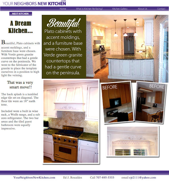
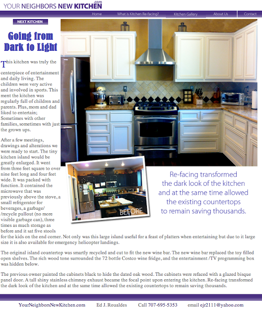
 Ed from Your Neighbors' New Kitchen.com did just that when he came to me. He brought me a copy of an HGTV magazine and said he wanted his new website to be like that - focus on the kitchen design, big beautiful pictures, small before photos, something fun, colorful, bright, interesting, and informative about kitchen re-facing. That is what we designed him. A colorful website that focuses on the kitchens. Check out his website online - www.YourNeighborsNewKitchen.com
 Below are samples from his website we designed last month. Enjoy.
I love working with my clients on a variety of projects from logo design, advertisements, brochures, educational materials, exhibits, flyers, posters, identity packages, business cards, mailers, or websites. Mainly if you need it printed or put online Susan Searway Art & Design can help you get it there.


No comments:
Post a Comment